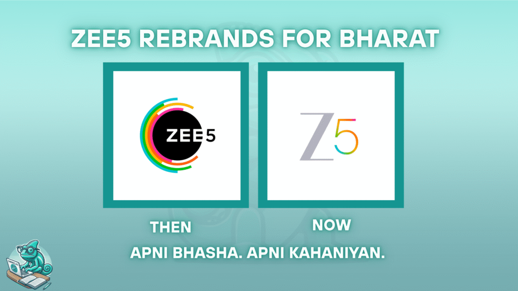
From Bold Circles to Minimal Z5: The Visual Evolution
ZEE5’s former logo was loud, colorful, and expressive — a symbol that tried to encompass the platform’s wide reach and diverse offering. The new identity, however, is clean, minimal, and modern: a stylized “Z5” that retains brand recall while signaling maturity.
This shift mirrors a larger trend across digital platforms: minimalism that stands out through clarity, not clutter. But for ZEE5, the design change isn’t surface-level. It reflects the company’s decision to lean into regional relevance, cultural nuance, and targeted user experiences.
What’s Driving the Change? A Language-First Strategy
The rebrand comes with a well-defined mission: to prioritize regional audiences through content and pricing that speak directly to them.
ZEE5 is launching seven curated language content packs — each with its own editorial focus and culturally aligned storytelling. Languages include Hindi (with Punjabi and Bhojpuri), Tamil, Telugu, Bangla, Marathi, Kannada, and Malayalam. Each pack is designed not just to translate entertainment but to embed it in the lived experiences of its audience.
Over 130 new originals are planned for FY26, signaling serious investment in non-Hindi narratives. These aren’t simply regional adaptations — they’re full-fledged stories with their own creative voices, drawn from local realities, folklore, urban movements, and social themes.
New Pricing Models: Affordability Meets Accessibility
Accompanying this narrative shift is a smart pricing model:
- ₹120/month for regional language packs
- ₹220/month for the Hindi pack
- ₹320/month for an All Access bundle
- Yearly plans are available for deeper discounts
This tiered structure recognizes India’s fragmented media consumption patterns and aims to bring OTT access to tier 2, 3, and rural audiences — a segment long underserved in premium streaming.
What This Rebrand Really Means
According to ZEE5 executives, the rebrand is not a marketing stunt — it’s a cultural alignment. It’s about creating a product that doesn’t just reach Bharat but resonates with it.
“When content is told in your own language, it doesn’t feel like content — it feels like your own story,” says Kartik Mahadev, CMO at ZEE5.
This idea echoes across India’s shifting media landscape, where hyper-local content is no longer seen as niche but as essential. In this context, ZEE5’s rebrand is both a strategic move and a necessary evolution.
Our Take: Why This Matters
Design as Signal: The new logo is a clear visual cue of simplification and focus. It tells viewers ZEE5 is growing up — and narrowing in.
Regional is Mainstream: With global OTTs slow to adapt locally, ZEE5’s regional-first play feels timely and competitive.
Affordability = Loyalty: By recognizing pricing sensitivity, especially in smaller towns and rural areas, ZEE5 is creating a model that encourages subscription over piracy.
Final Thoughts
ZEE5’s new identity is not just a branding update. It’s a roadmap for what the future of Indian entertainment could look like: personalized, localized, and proudly multilingual.
In a market often focused on mass appeal, ZEE5 has chosen depth over breadth — and in doing so, may have just set the tone for the next chapter of OTT in India.
No responses yet