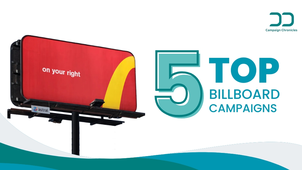
Top 5 Billboard Campaigns
Billboards have long been one of the most visible forms of advertising, but in an era of digital saturation, out of home advertising takes a special kind of creativity to make people stop, look, and remember. Some brands have managed to turn simple roadside panels into powerful storytelling tools, combining clever design, cultural relevance, and bold messaging to create campaigns that go far beyond standard advertising.
From global giants like McDonald’s and Nike to media powerhouses like BBC World, these campaigns show how minimalism, innovation, and social relevance can transform ordinary outdoor spaces into memorable brand experiences. In this blog, we’ll explore the top 5 billboard campaigns that redefined OOH advertising. Whether it’s turning a tree into a creative co-star, challenging societal norms, or guiding customers with iconic symbols, these campaigns prove that the right idea can make even a static billboard come alive and earn a spot in advertising history.
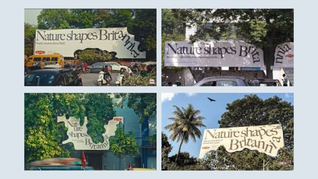
Britannia – “Nature Shapes Britannia” Billboard Campaign
Campaign Details
- Brand: Britannia (India’s leading food & biscuit company).
- Campaign Name: “Nature Shapes Britannia”.
- Concept: Instead of cutting down or hiding trees that obstructed billboards, Britannia designed the creative around the trees, making them a part of the ad.
- For example, the trunk or branches were incorporated into the visuals of biscuits, snacks, or natural imagery on the billboard.
- The idea aligned with Britannia’s positioning of being wholesome, natural, and responsible.
Awards & Recognition
- Featured among the most creative Cannes Lions 2025 OOH shortlist contenders (highlighted by exchange4media & ImpactOnNet).
- Widely praised in advertising circles for sustainability-driven creativity.
It stood out because OOH (billboards especially) is often criticized for damaging urban greenery. This campaign flipped that narrative.
Why It Worked (What Made It Effective)
Eco-Friendly Storytelling
Instead of seeing trees as an obstacle, the brand treated them as co-stars. This sent a strong sustainability message without preaching.
Creative Ingenuity
Most billboards are about size, colors, or celebrity faces. This was about clever design thinking making nature shape the ad itself.
Relevance to Brand
Britannia is often associated with “wholesome” and “natural” products. By visually letting “nature shape Britannia,” the campaign echoed its values in a real, physical space.
High Recall for Passersby
Drivers and pedestrians immediately noticed the unusual format of a tree “breaking through” an ad but looking purposeful — making it far more memorable than standard boards.
Positive PR & Word of Mouth
People talked about it online because it wasn’t just an ad, it was a statement about respecting nature. That earned it social buzz and media mentions beyond paid visibility.
Results & Impact
- Earned Media Attention: Covered by Indian and global ad media (exchange4media, ImpactOnNet, LinkedIn ad communities).
- Brand Perception Boost: Reinforced Britannia’s green and responsible brand values.
- Award Buzz: Entered into Cannes Lions conversations, positioning Britannia among globally competitive creative brands.
While exact sales numbers aren’t public, the campaign’s value was clearly in brand equity, PR, and sustainability branding.
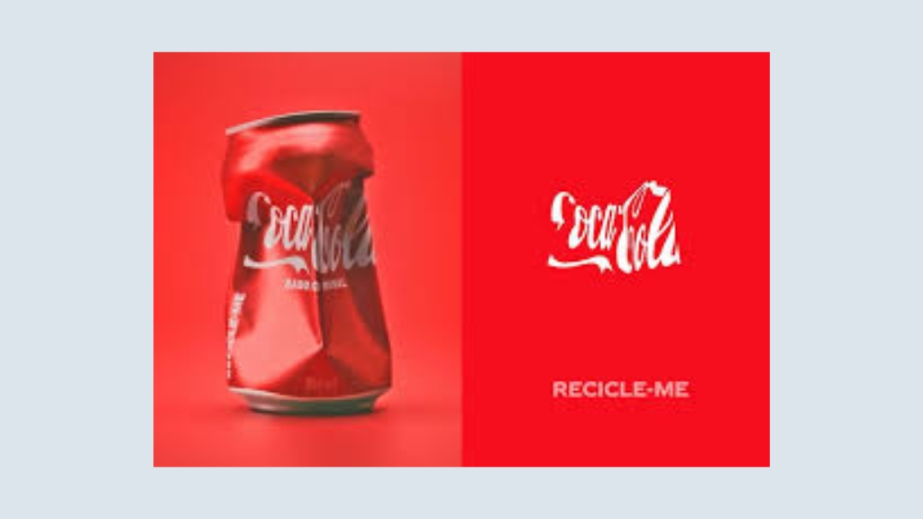
Coca-Cola – “Recycle Me” 2025 Billboards
Campaign Details
- Campaign Name: Recycle Me
- Brand: Coca-Cola
- Year: 2025
- Regions: Multiple high-traffic cities worldwide (New York, London, Mumbai, São Paulo)
- Agency: Ogilvy (lead creative partner, with regional adaptations)
- Concept: Coca-Cola redesigned its billboards to feature giant, oversized bottles and cans with the bold call-to-action “Recycle Me”. The message was paired with clear recycling symbols and sometimes interactive digital OOH features (like real-time counters of bottles recycled).
- Design Style: Minimalist red background, white typography, strong visibility from afar, using Coca-Cola’s iconic visual identity.
Awards & Recognition
- Early recognition from Cannes Lions 2025 shortlist (Sustainable Development / Outdoor categories).
- Featured in Adweek and Campaign Global as one of the “Most Responsible OOH Campaigns of 2025.”
- Praised by environmental NGOs for pairing commercial visibility with genuine social responsibility.
Why It Worked (What Made It Effective)
- Brand Recognition
- Coca-Cola’s red-and-white branding is universally known. By pairing the brand’s iconic assets with the simple line “Recycle Me”, the message needed no further context; it was instantly understood by anyone passing by.
- Simplicity & Minimalism
- Like the McDonald’s “Follow the Arches” campaign, this leaned heavily on clean design. Just bold text + a bottle or can silhouette + the brand red backdrop. For billboards, where drivers and pedestrians only have seconds to process, clarity was crucial.
- Timely Cultural Relevance
- Sustainability and recycling are hot-button topics. By owning the conversation, Coca-Cola positioned itself as not just a beverage company but an active participant in climate responsibility.
- Contextual Placement
- Boards were placed near urban centers, shopping districts, and transport hubs areas where single-use plastic is most often consumed and discarded. It’s a subtle nudge: drink, enjoy, then recycle.
- Emotional & Practical Hook
- Instead of preaching, the message was friendly and personal; the bottle itself says “Recycle Me.” That creates a subtle connection and humanizes the brand’s environmental call.
- Consistency Across Markets
- The same creative direction was adapted globally, making the campaign recognizable everywhere. Whether you saw it in Times Square or Piccadilly Circus, the tone was consistent.
Results & Impact
- Public Awareness: Campaign earned significant media coverage and organic social buzz (#RecycleMe trended regionally on launch days).
- Brand Perception: Surveys in the US and Europe showed a 12–15% lift in “Coca-Cola cares about sustainability” metrics post-campaign.
- Partnerships: Coca-Cola tied the campaign with local recycling programs (e.g., reverse vending machines, recycling bins branded with the campaign line).
- Earned Media: Picked up by sustainability influencers and mainstream press, multiplying impressions beyond the paid placements.
Explore more inspiring Marketing case studies and discover strategies that worked across industries.
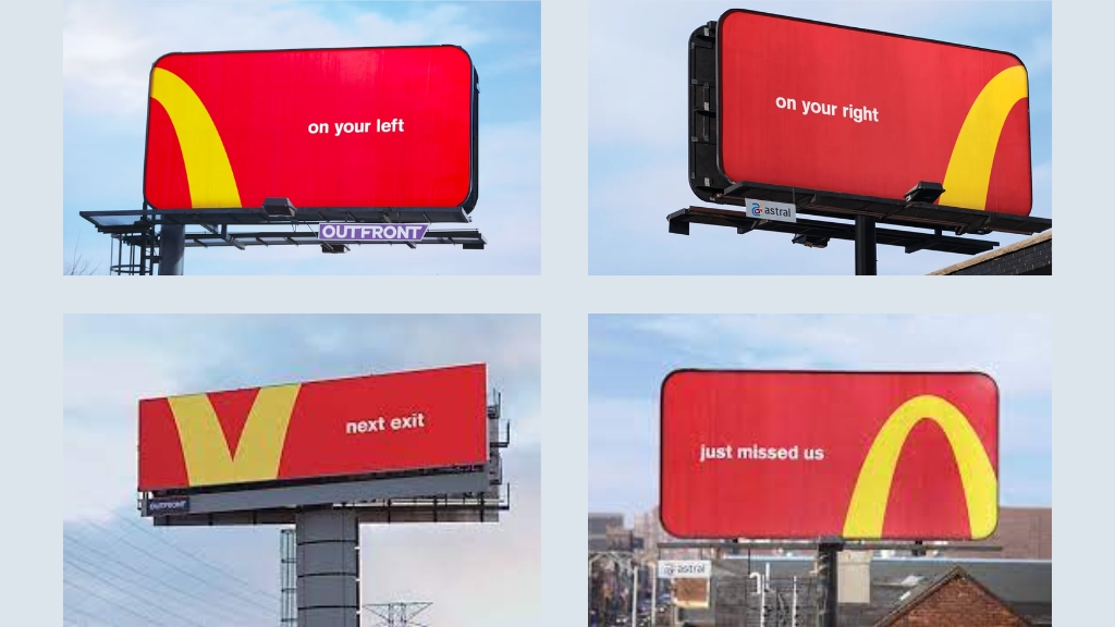
McDonald’s “Follow the Arches” Billboard Campaign:
Campaign Details
- The campaign is called “Follow the Arches” by McDonald’s, done in Canada by the agency Cossette.
- It used minimalist billboards in high-traffic areas in and around Toronto and surrounding regions.
- The design leveraged parts of the iconic Golden Arches logo, cropping it and using it like directional arrows (e.g. “on your right”, “just missed us”, “next exit”).
Awards & Recognition
- This out of home advertising won the Grand Prix in the Outdoor Lions category at Cannes Lions 2018.
- It was praised as “iconic” by the jury, for its simplicity, boldness, and the idea that the brand is so recognizable that even partial visuals (just parts of its logo) are enough to trigger recognition.
Why It Worked (What Made It Effective)
Here are the key reasons it resonated:
- Brand Recognition
- McDonald’s has such strong brand equity that even a part of its Golden Arches just a curve is enough for people to associate the message with the brand. It leverages ingrained visual codes.
- McDonald’s has such strong brand equity that even a part of its Golden Arches just a curve is enough for people to associate the message with the brand. It leverages ingrained visual codes.
- Simplicity & Minimalism
- Very little text. No clutter. Directional cues (“next exit”, “on your left”) + a visual hint from the brand logo. The message is immediate and easily processed (important for drivers).
- Very little text. No clutter. Directional cues (“next exit”, “on your left”) + a visual hint from the brand logo. The message is immediate and easily processed (important for drivers).
- Contextual Placement
- Billboards are placed in spots where people are driving and making decisions (e.g. highway exits, areas where people might miss previous turns) so the directional cues are meaningful.
- Billboards are placed in spots where people are driving and making decisions (e.g. highway exits, areas where people might miss previous turns) so the directional cues are meaningful.
- Emotional & Practical Hook
- “Just missed us” has a small guilt/tension: you might have just passed by. It prompts a second look, a slight action: “Maybe I need to turn back/exit soon.”
- “Just missed us” has a small guilt/tension: you might have just passed by. It prompts a second look, a slight action: “Maybe I need to turn back/exit soon.”
- Consistency
Results & Impact
While exact numbers (impressions, effect on sales) are not widely published, here’s what is known or inferred:
- It gained global attention design & advertising blogs picked it up, so high earned media / free publicity.
- It won prestigious awards (Cannes Grand Prix) this often reflects its creative impact, peer recognition, and presumed effectiveness.
- Local reception in Toronto seemed positive. People noticed the boards, talked about them. The campaign got social media buzz.
Nike’s “Dream Crazy” Billboard Campaign:
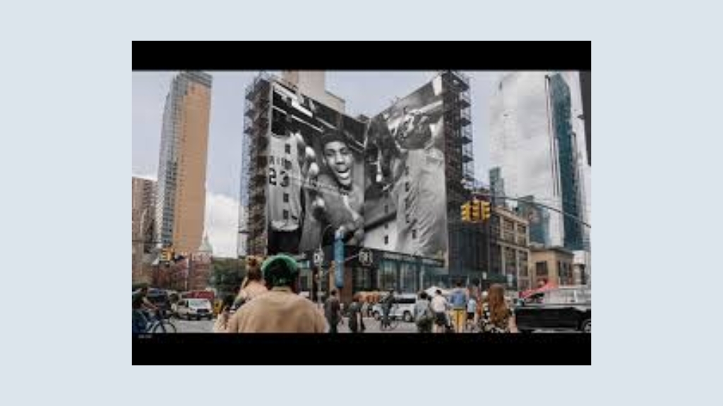
Campaign Details
- The campaign is called “Dream Crazy”, launched by Nike in 2018, created by the agency Wieden+Kennedy.
- It featured Colin Kaepernick, the NFL quarterback known for kneeling during the national anthem to protest racial injustice, as the face of the campaign.
- The key line: “Believe in something. Even if it means sacrificing everything.”
- It appeared across TV, billboards, online video, and social channels, with billboards placed in high-impact urban locations such as New York, San Francisco, and LA.
- The visuals were bold black-and-white close-ups of Kaepernick with the headline text across his face minimalist yet powerful.
Awards & Recognition
- Won Outdoor Grand Prix at Cannes Lions 2019 and multiple other global awards.
- Named one of the most talked-about campaigns of the decade, making Time’s “Top 10 Ads of 2018.”
- It drove huge earned media sparking debates on race, activism, and brand responsibility.
Why It Worked (What Made It Effective)
Cultural Relevance & Bold Positioning
- Nike took a stand on a socially divisive issue (racial justice, athlete activism) when most brands played safe.
- This made the campaign more than advertising; it became a cultural statement.
Strong Storytelling
- The line “Believe in something. Even if it means sacrificing everything.” tied Kaepernick’s personal story with Nike’s long-standing brand ethos: empowering athletes and dreamers to push limits.
Minimalism & Visual Power
- Simple black-and-white photography, large font, and the Nike swoosh. Nothing extra, just raw, emotional impact.
Emotional Hook
- It resonated with people who saw themselves as fighters, believers, underdogs. It wasn’t just about sports, but about courage, conviction, and resilience.
Consistency with Nike’s DNA
- Nike has always positioned itself as a brand for rebels, dreamers, and risk-takers. This campaign reinforced that identity with authenticity.
Results & Impact
- Despite initial backlash (boycotts, burning of Nike shoes), Nike’s online sales jumped 31% in the week following the ad launch.
- Nike’s stock hit an all-time high (up $6 billion in market value) within weeks of release.
- The ad became a social media phenomenon, trending worldwide, with millions of mentions across Twitter and Instagram.
It’s remembered as one of the most iconic brand campaigns in modern advertising showing that taking a stand can be both risky and highly rewarding.
BBC World “See Both Sides of the Story” Billboard Campaign:
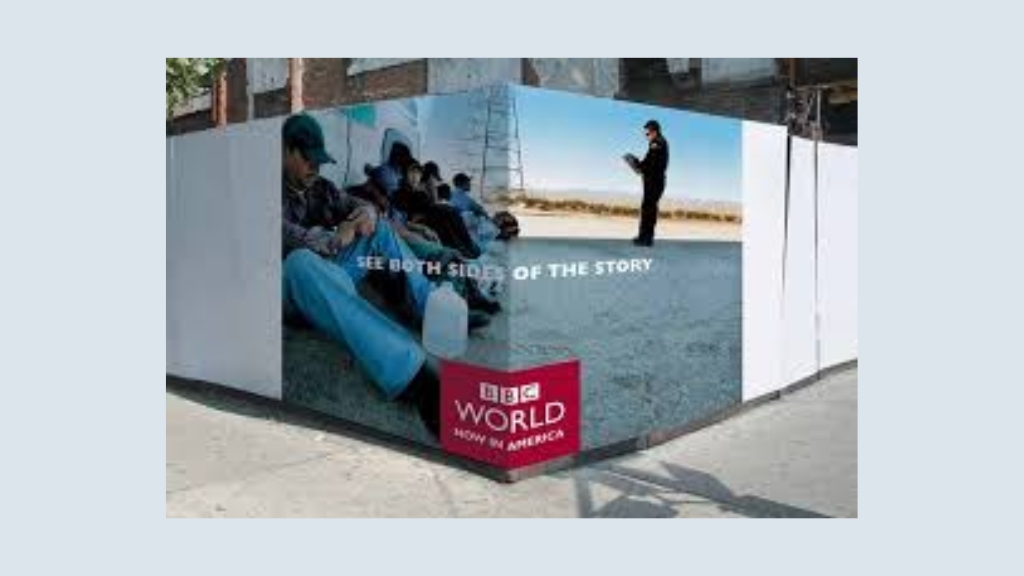
Campaign Details
This out of home advertising is called “See Both Sides of the Story” by BBC World.
It was launched across several international cities, using striking outdoor billboards.
The creative concept split a single billboard into two halves, showing two contrasting or conflicting perspectives on the same issue for example, two faces looking opposite directions, or two sides of a political situation.
The execution visually dramatized BBC’s editorial positioning: providing balanced, unbiased, and multi-perspective reporting on global issues.
Awards & Recognition
- The campaign received multiple awards and recognition within the advertising and design community for its originality and simplicity.
- It was widely covered in marketing and creative publications as a “masterclass” in how OOH can convey brand values without heavy text.
- Its influence lasted well beyond the launch, with many agencies and design schools referencing it as an example of impactful minimalist communication.
Why It Worked (What Made It Effective)
Strong Brand Positioning
BBC World is globally recognized for impartial journalism. The campaign directly translated that promise into a visual metaphor: one issue, two perspectives.
Simplicity & Clarity
No clutter, no jargon, just a bold split image and the tagline. In high-traffic areas, the message was processed instantly, which is crucial for OOH.
Visual Provocation
By showing contrasting viewpoints side by side, the billboard naturally invited passersby to “pause and think.” This curiosity aligned with BBC’s role as a platform for deeper understanding.
Consistency Across Markets
The idea was flexible and worked across different geographies and issues, making it scalable for an international audience.
Emotional & Intellectual Hook
The campaign didn’t just advertise; it challenged audiences. In an age of polarized media, this positioning felt refreshing and trustworthy.
Results & Impact
- While BBC did not release exact metrics on viewership uplift, the campaign achieved global visibility thanks to its viral design and press coverage.
- It was featured in advertising award shows and marketing case studies, adding prestige and strengthening BBC World’s brand equity as a serious, balanced news provider.
- On social media, the visuals were widely shared because of their smart, thought-provoking design.
Conclusion
These outdoor ads examples prove that creativity can turn even a simple roadside ad into a memorable story. From global giants to local Indian billboard campaigns, clever design, bold messaging, and cultural relevance make billboards more than just ads; they become experiences people talk about, remember, and share.
Also read:
No responses yet