How one team’s identity shift tried to change more than just a name.
What Happened?
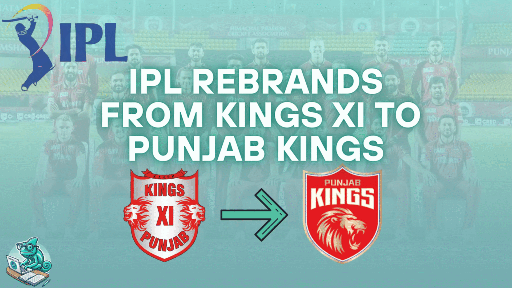
In 2021, the Kings XI Punjab franchise rebranded as the Punjab Kings — dropping the “XI” and embracing a cleaner, more inclusive identity. But the move wasn’t just about aesthetics. It was a calculated attempt to reframe the team’s perception, unify its brand voice, and break from a legacy of underperformance.
But did it work?
Why the Rebrand?
The IPL is as much about storytelling as it is about cricket. Franchises are brands — and every brand must evolve.
Punjab Kings wanted to:
- Shed the “never-winning” baggage of Kings XI
- Present a bolder, pan-state identity (not just “XI” = team)
- Refresh their brand visuals and merchandise appeal
- Align with modern, simplified team naming conventions (like Gujarat Titans, Lucknow Super Giants)
“We are now more inclusive and more forward-looking.” – Satish Menon, CEO of Punjab Kings
The Strategy Behind the Shift
This wasn’t a radical transformation. It was a subtle brand polish:
- Retained core colors (red + gold)
- Shortened name for simplicity
- Rolled out new logo, jerseys, and merchandise
- Relaunched with updated digital creatives and brand campaigns
They leaned into bold typography, shield symbolism, and a stronger “King” persona, focusing on power, not just cricketing tradition.
Public Reaction & Media Buzz
The change received mixed reactions:
- Some praised the clarity and simplicity
- Others questioned if it would truly help the team’s performance
- Social media saw a spike in interest post-rebrand, especially around merchandise sales
It worked — visually and commercially — but without performance follow-through, the story risked fading fast.
What Makes a Sports Rebrand Work?
Rebranding in sports isn’t just about logos. It’s about:
- Rewriting legacy
- Building fresh associations
- Unlocking new sponsorship and merch opportunities
- Reconnecting emotionally with fans
Punjab Kings aimed to do all of this, but the missing link? Consistent on-field success.
The Brand Scorecard
| Element | Score (out of 5) | Notes |
| Visual Identity | ⭐⭐⭐⭐☆ | Clean, strong, more modern |
| Storytelling Shift | ⭐⭐⭐☆☆ | Mild evolution, lacked emotional hook |
| Fan Engagement | ⭐⭐⭐⭐☆ | Spiked during launch, dipped later |
| Long-term Recall | ⭐⭐☆☆☆ | Brand still searching for “iconic” |
Marketer Takeaway
A name change is only the start.
Without consistent storytelling, performance, and fan-first culture — it’s just another jersey swap.
Caméo’s Corner
“You can drop the XI, but you can’t drop the narrative. Real rebrands change the feeling, not just the font.”
Final Word
The Punjab Kings rebrand was clean, timely, and commercially sound. But for it to truly cement itself in IPL’s brand hall of fame — it’ll take more than a name. It’ll take a narrative.
Want us to decode another IPL team’s brand strategy? Drop your suggestion in the comments or tag us @cmpgnchronicle.
No responses yet